Neil Berry
An experienced, curious & versatile digital product designer.
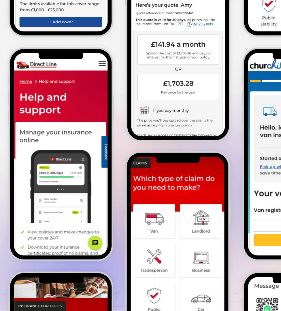
Senior UX Designer with over 15 years of turning real customer insight into high-performing digital journeys.I currently lead UX for Commercial Direct at Aviva and Direct Line, driving seamless experiences across public liability, van, small business, tradesman, and landlord insurance journeys.
Core strengths
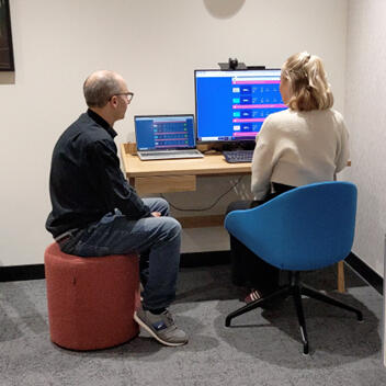
I focus on designing customer-centred digital experiences and strategies that drive self-service, reduce costs, and improve satisfaction.
I collaborate well with cross-functional teams - engineers, content & product - to ensure solutions are desirable, feasible and viable.My background spans insurance, financial services, charity, and logistics.
I have delivered everything from secure authentication flows for banks to launching self-service websites that empower customers to get support and manage their policies independently, reducing call volumes and driving engagement.
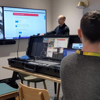
I solve problems and drive commercial outcomes, demonstrating the value design delivers to the business.Track record of improving conversion across insurance quote and buy journeys through data-driven design, experimentation and usability testing insight.
About me
Experience Design Consultant at Direct Line Group, now Aviva.
I'm Neil Berry, a curious and multi-disciplinary product designer with over 15 years of experience designing and building digital products for web and mobile.My passion for design and creation started at university in 2003, where I built my very first website and began to teach myself how to code to bring my ideas to life. Design is at the heart of creating engaging and user-centred digital experiences. It didn't take me long to realise it drives business success too. I'm deeply passionate about the creative process and love understanding user goals, motivations, and pain points and using this knowledge to inform my design decisions.With a strong blend of UX and front-end skills, I've held various design roles in companies like Direct Line Group , Charities Aid Foundation, Logistics UK and GE.I live in Tunbridge Wells, Kent with my wife (and fellow UXer), Christine, and our young son.
Build the right things and build them right

Experience
| Year | Role / Company |
|---|---|
| 2021 — Current | Experience Design Consultant — Direct Line Group |
| 2016 — 2021 | Senior UX Design Manager — Charities Aid Foundation |
| 2008 — 2016 | Senior UI/UX Designer — Logistics UK |
| 2003 — 2008 | Web Developer / Designer — GE Capital Aviation Training |
Case studies
Scaling Digital Giving Through Self-Service Campaign Design
| Role | Product | Users |
|---|---|---|
| Lead UX Designer | CAF Donate | 10,000+ charities |
The opportunityCharities needed a faster, more reliable way to create donation campaigns they could embed on their own websites. The existing process caused drop-offs, lost progress, and high support demand.Improving this experience was a strategic priority within the CAF Operating Plan to drive growth and scale digital capability.What I deliveredA new campaign set-up wizard that enables charities to create, preview, and publish donation pages with confidence.Key improvements included:
A guided step-by-step flow that simplified campaign creation
Live preview across desktop and mobile
Auto-save to prevent data loss during interruptions
Inline guidance to help charities optimise campaigns
Automatic image resizing for mobile
Research and validationI ran three rounds of usability testing using realistic scenarios and task-based exercises. Testing focused on usability, confidence, and error prevention.The live preview, auto-save, and mobile image handling addressed the most common pain points and reduced reliance on support. Testing showed users treated publish as a next step. We added a sticky header and repositioned the button to clearly separate publishing from navigationImpact
Faster and easier campaign creation for 10,000+ charities
Reduced customer support demand, saving time and cost
Increased confidence and positive word of mouth
Contributed to strong CAF Donate performance:
£870m in projected growth
Fee income 9 percent ahead of budget
Receipts 15 percent ahead of budget
The wizard was cited as a key driver of Donate’s continued growth following launch.
Increasing CADF customer donations by 8%
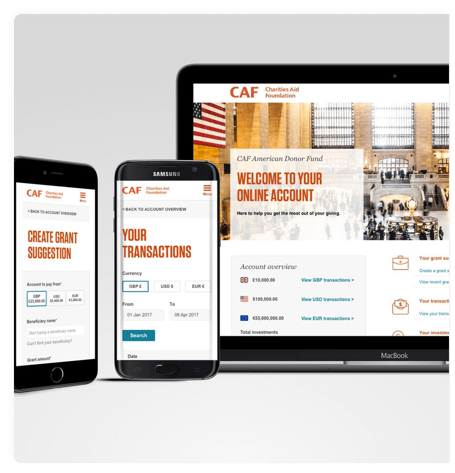
CAF American Donor Fund (CADF), a leading platform in offering philanthropy services for dual UK and US taxpayers. A smart, tax-effective way to achieve greater impact with customers' philanthropy.
More than $1 billion donated since its creation. My UX improvements increased the amount of donations reaching charities around the world.

2-Factor Authentication for CAF Bank's 16,000 customers to enhance security
I designed a Two-Factor Authentication (2FA) solution for CAF Bank customers, enhancing the security of their data and transactions.
With £1.5 billion in deposits, the solution was integrated into key user journeys to ensure regulatory compliance, including sign-ups, payment authorisations, user management, login verifications, and settings.
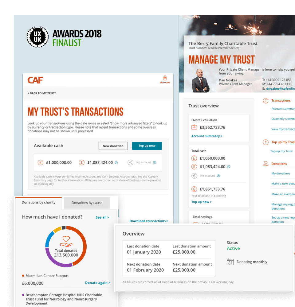
Using a combination of data analysis and customer testing, I redesigned the Trust Account platform, increasing CAF's donations by 26%
Redesign provided expert guidance to individual donors, helping optimise their giving plans across the UK and internationally. This led to a 26% increase in donations to charities in 2021/22.
Finalist at the UX UK Awards 2018 in the categories of Best User Experience and Best Impact on Business Goals.
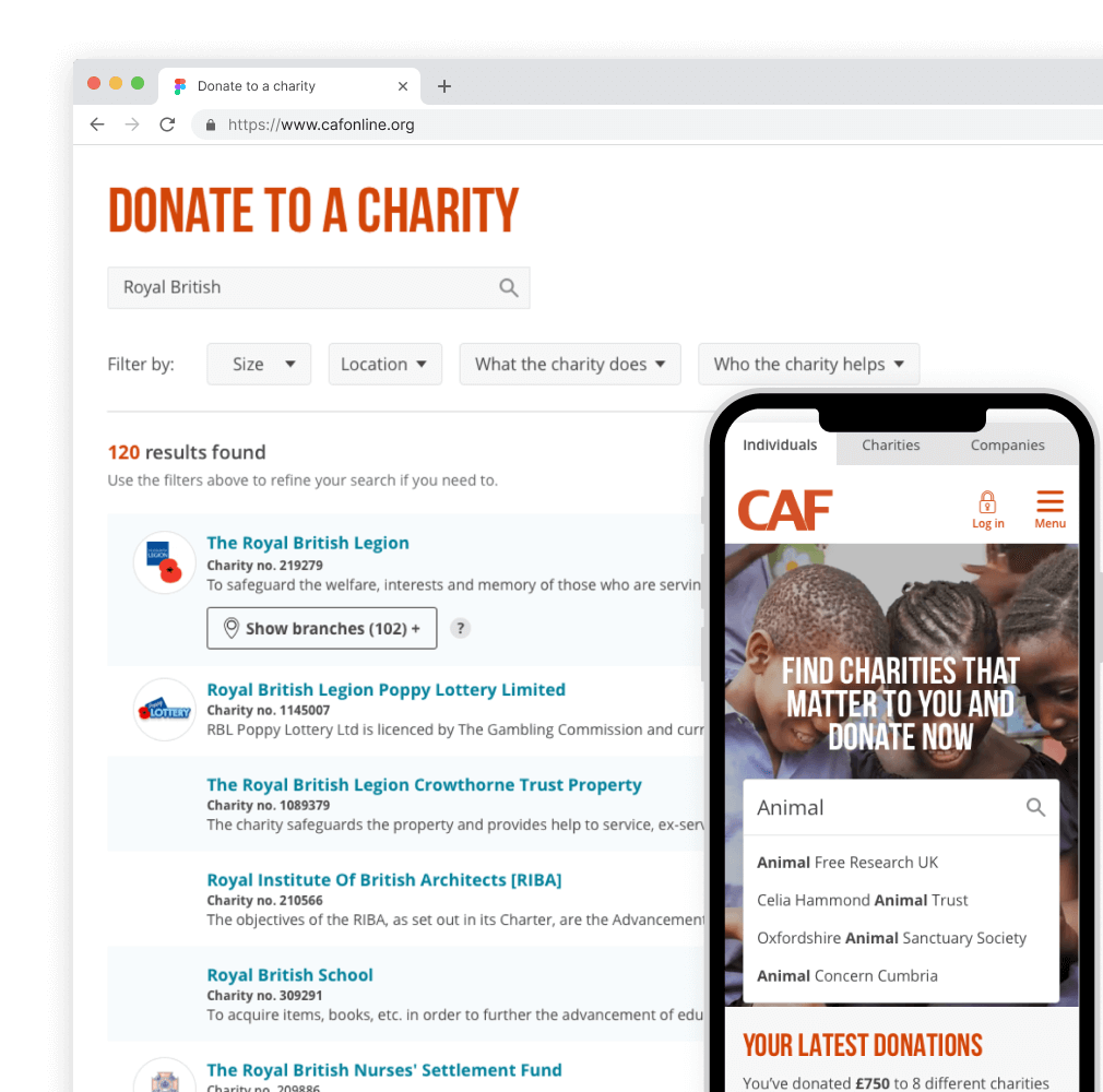
Increasing CAF's donations by 15% and sign-in rate to their giving account
CAF's Charity Search is the first step of their digital donation journey, allowing customers to discover 170,000 verified UK charities. A fast, simple way to find the causes they care about.
Contact me
Looking to collaborate or have a question?Feel free to write to me using the form below. I read and reply to all my emails.
